
.svg)
.svg)

Nova Scotia department of Transportation & Infrastructure Renewal
4 months (2019)
The injured workers, post-healing, faced a major delay in returning-to-work.
Separate paper-based assessments introduced perplexity in comparison between 3 different government organizations because each had native comparison methods.
To eliminate people scratching their heads, a standardized B2B enterprise system had to be created to satisfy users from diverse demographics, expertise and mental models.
UX Researcher & Information Architect
• Led a team of 6
• Champion of UX across multiple cross-functional teams
• End-to-end UX research
• Experience strategy for enterprise product
• Designed high-fidelity prototypes rich in information architecture
participants scored >9/10
in perceived user comfort.
reduction of
average filling time.
reduction in
average reviewing time.
• Agile UX + Lean startup cycle
Organizational research:
• Remote stakeholder interviews
• Organizational ethnography - Focus on culture & operation styles
• Executives, laymen and team alignment workshops
• Flat-organization workshops
Ethnographic user research:
• Contextual inquiries
• Task analysis
• Work study
Strategical research & synthesis:
• User personas
• SWOT
• Empathy map
• Buy-a-feature (NEW)
• Information architecture (Content strategy & Site map)
• Paper sketches
• Wireframes
• Rapid Prototyping - Medium fidelity prototypes
Information architecture testing:
• Card sorting
• Tree testing
Formative testing:
• A/B testing.
• Formative moderated usability testing (In-person & Remote)
• Summative usability testing pipeline (Time & Efficiency)
Block Quote
• Distinct user demographics and knowledge of expertise
• Tech-averse audience
• Low budget
• Big scope but short time
• UX designer & researcher (myself)
• Front-end developer
• Back-end developer
• Kinesiologist
• Ergonomist
• Healthcare and safety specialist
A direct causation of improving the assessor's experience resulted in making the assessment process efficient and cost-saving (direct & indirect). This project acted as a seed for an enterprise system in the long run.

Why?
- Dynamic requirement/need updates.
- Need for weekly deliverables.
Results:
• Achieved large goals in short time.
• An MVP with visible improvements boosted internal trust.
Since the product updates (especially feature sets) were volatile, to cope up with the product road map, I led the team to follow partially-agile methods for the course of this project. No specific standards were adopted, but the core principles were brought in.
To bring out the novel product into full functioning ASAP, the lean startup cycle was combined with agile methods. This made swift delivery of the Minimum Viable Product (MVP) possible.
As a result, the craving for immediate benefits, for the client organization as well as users, was achieved in a short span. Significantly, under the given time, it revived the possibility of large work under short time.
Why?
- Understand the enterprise culture.
- Identify viable communication channels.
- Find out 'What outcomes speak?'
Results:
• Understand exactly how can an enterprise system integrated.
• Conclude on business needs, scope & objectives.
To set the scope and nature of the product, a complete understanding was achieved by exploring the organizational ideologies, communication standards, organizational structures, project expectations and delegation mechanisms.
I aligned the team and the stakeholders by devising measurable goals through workshops, meetings, knowledge-sharing sessions and presentations. The creep of the product’s scope was eliminated by completing a thorough organizational research.
1st discussion: Bring in new paper-based forms
2nd discussion: Can attach photos in the forms
3rd discussion: Cost benefits of human-centered tech
4th discussion: A paper-based form + an electronic form
5th discussion: A print-friendly electronic platform (DECIDED)
6th discussion: ***The surprise awaits at the end of case study***
Unraveled the actual organizational needs by conducting:
• Remote stakeholder interviews
- What is the level of UX maturity within the organization?
- What future does the management wishes to build?
- How significant is this project to satisfy internal expectations?
• Plan & strategy back tracking (bottom-to-top)
- How does authority and task delegation work?
- What does the ground-zero workers think of the superiors?
- What loopholes are present in the existing system?
• Flat organization meetings
- Easiest way to find common grounds.
- A storytelling session of distinct personas to empathize daily responsibilities.
- A passive social that significantly reduces the impact of Hawthorne effect.
I established a good rapport with the business executives and our team by leading & conducting a daily scrum. Basking in the trust I created, positive side effects that were due, unfolded as follows.
The daily status updates created transparency in our work, approach and effects towards solving problems. This paved way to hear out our recommendations regarding change management and controlled communication at the executive level during deployment.
• Establish a standardized and efficient system.
• Create the product to act as a communicable bridge.
• A flexible product for the longer run (MVP).
Why?
- Identify 'What we can provide to the users?'
- Spot the loopholes in the existing system.
- Evidence to synthesize strategy & design.
Results:
• Raw, unfiltered & unbiased (to a certainty) qualitative data to expose the current state.
• Quantitative data directed to establish metrics for the project.
To understand the types of users who would benefit from the product, the user's mental models, company-specific informal communication methods, user personas & their behaviors and the indirect stakeholders were studied.
The organizational research helped me find a varied distribution of users. The target users squared up were mechanics, insurance assessors, healthcare workers, doctors, managers & executives.
Identified wants, needs and hidden requirements through:
• User interviews
- An introductory session to get to know the users.
- Found the symptoms, users' wants and visible pain points.
• Contextual inquiries
- More like a 'formal date' with an individual user.
- Played a vital role to understand users in-depth and find actual problems.
- As a moderator, I addressed a checklist of topics while striking a natural conversation.
• Task analysis (observe, record & organize)
- Simultaneous with contextual inquiries.
- The kinesiologist and I switch roles in asking and assessing.
- Played a vital role in deconstructing activities to micro-level.
- Helped the team in drafting information architecture.
• User surveys
- To confirm and validate qualitative data remotely from a large sample.
- The questions also identified individual needs & accounted multiple perspectives.
- Resulted in confirming the hypotheses and the numbers helped to increase trust on UX from management.
• Work study
- Teamed up with ergonomist and kinesiologist in identifying needs of the validators.
- An analytic session with frequent ground-zero visits helped me, as a UX researcher to understand the substance of the processes.
Every data gathering methods were conducted based on ethnographic research methods because the focus was to on collect raw, unfiltered and unbiased qualitative data.
• Easier, quicker, comfortable and a clear B2B system.
• Flexible content and error-resistant architecture.
• Make the switch to the new product efficient & effortless.
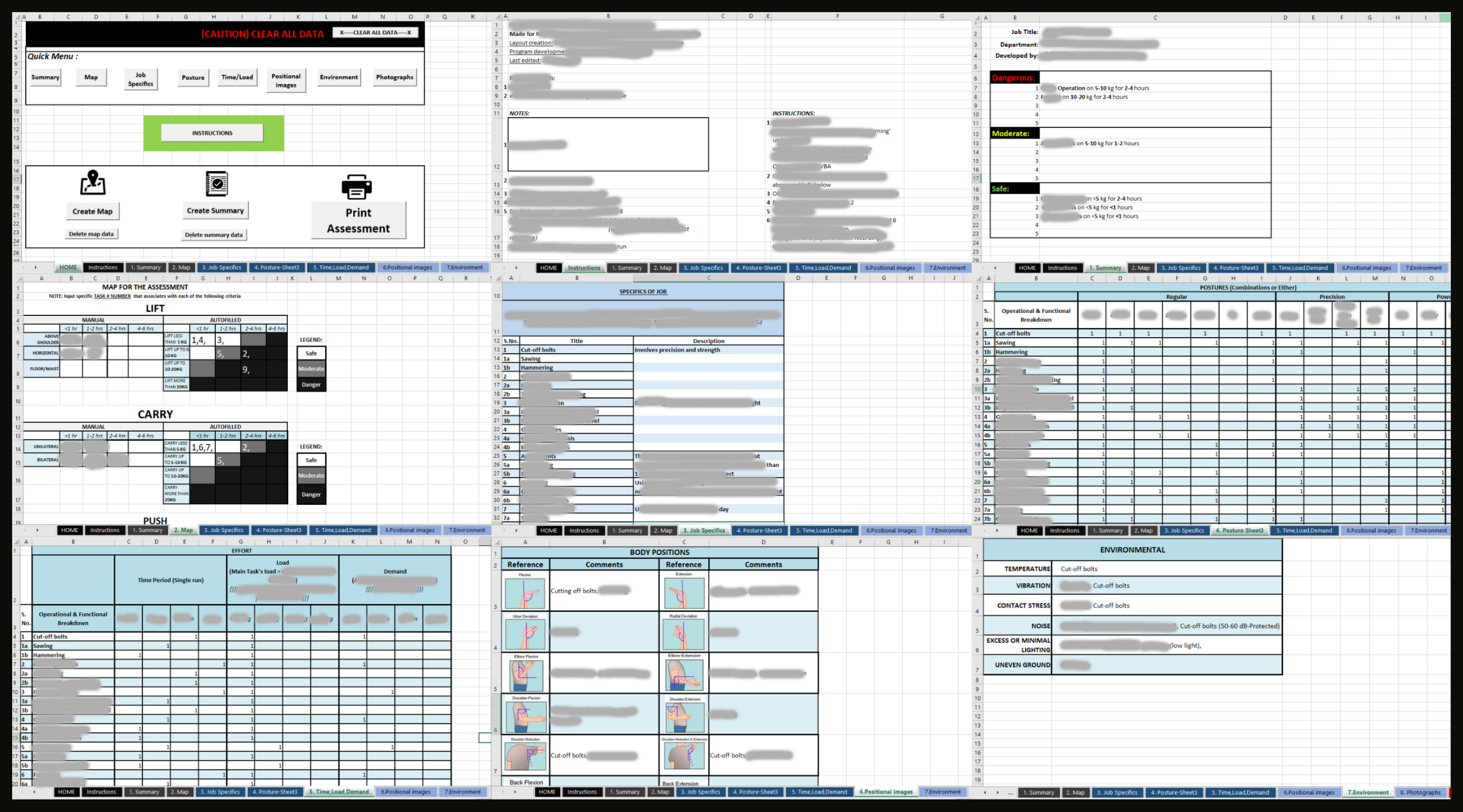
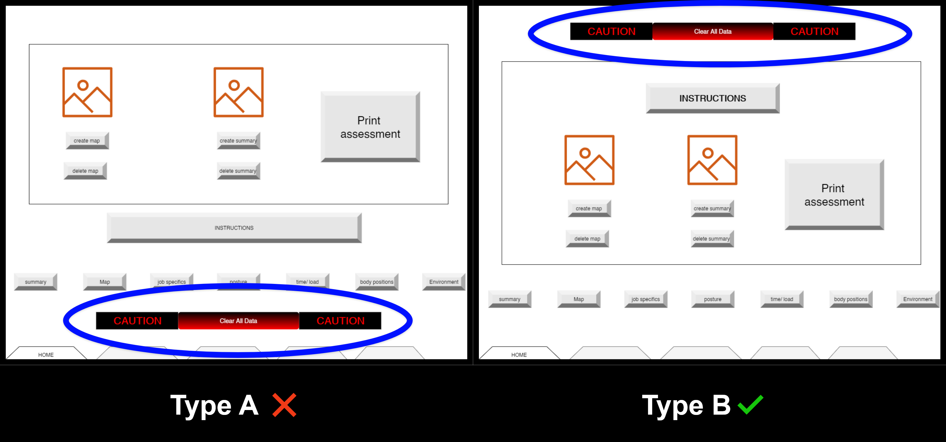
The most common tech platform used by all user personas was MS Excel. Keeping the users' comfort in mind and to achieve a smooth transition of change in the longer run , the initial prototype was built on MS Excel and tested .
Why?
Educate myself and in turn educated my team & the stakeholders to understand the end-users.
Results:
• Goals established to solve the problems that aligns with the experience strategy.
.png)
Why?
- Testing ideas and IA at the early stages exposes strong and weak user flows.
Results:
• >95% success rates in all tests
• Precise feature sets at the intersection of budget, feasibility and requirements.

Why?
- Testing ideas and IA at the early stages exposes strong and weak user flows.
Results:
• >95% success rates in all tests.
• Precise feature sets at the intersection of budget, feasibility and requirement.
The hypotheses generated from the research results were validated by creating, testing & iterating the ideas. The final plan after 2 iterations resulted in the following measures:
• Success rate >95% in all the tests.
• Conformation of info architecture with users’ mental models.
• Finalized feature set, content and info arch for the creations.
An executive report consisting of product road map (only MVP), experience strategy, process methodology, feature set, IA and content marked the end of ideation phase.
Why?
- Transforming ideas into reality.
Results:
• Introduced inclusion in creations through user friendly, accessible & simple designs.
.png)
Why?
- Champion a clear social cause as a team lead.
Results:
• Established accessibility as a basic need at the structural level of designs.

Why?
An interface used when taking notes on observation must be swift to learn and (simple + easy) to use.
Results:
• Created personalized dashboard and user flows for distinct user personas.
Why?
- Identify defects and feedback fixes ASAP.
Results:
- Tests performed at the end of each creative processes accelerated the iterative design process.
- Created an error preventing evaluative testing architecture.
Goals achieved:
- Find, fix and re-test errors.
- Create a transparent workflow model that helps within and outside the team.
- Communicate the product's value in terms of numbers of significance.


The final product achieved the following numerical outcomes:
Perceived user comfort
~92% participants scored >9/10
Filling time
~87% reduction of average filling time
Reviewing time
~62% reduction in average reviewing time
I also conducted on-boarding workshops which consisted of demo runs, walk-throughs and Q&A sessions to help the users familiarize with the new product. A user manual was created & distributed for making their experience on the long-run (in reference to the product road-map explained in the next section) fruitful.
To ensure acceptance of the new product,our team provided in-person & over-the-call support during the final week.
As a delight, I surprised the executives with two perks:
1. An overview of the future product road-map. This explained the need for a cloud-based environment and the necessity of B2B SaaS enterprise system. The road-map's walk-through was appended with the strategy to ease change management. The proposal was happily accepted with thanks and it is soon-to-be-implemented.
2. A workshop for assessors to facilitate a self-initiated summative usability testing pipeline to measure success metrics. I created assessment forms to address user issues as a feedback pipeline to help designers and developers once my contract is over. Also, I taught the inclusion of such insights in the areas in executive reports.
