Language learning immersion in a mobile app for an indigenous language

Associated organization

Mi'kmaw Kina'matnawey
2 months (2018)

Interact with the high-fidelity prototype (1 user flow) here

Context

The B2C mobile apps for learning the indigenous Mi’kmaw language was finding a hard time in retaining its users and the marketing metrics were on sloping downwards.

The users were not comfortable learning a new language from a mobile application with a book-like user interface.

The need of the hour demanded a single application, one that is heavily supported by cognitive and market research with a targeted experience strategy.

My Role

UX Researcher & Information Architect

• Led a team of 4
• Language learning immersion research & strategy
• Human information processor's cognitive load reduction
• Tactical research but in a waterfall project method
• One man UX
• First attempt in UI design (Hi-Fi prototyping)

Results

200%

increase in
recall rate.

100%

task completion rate
average filling time.

3

distinct
user personas
.

Project Overview

Research methods

Existing product research:
• User feedback analysis
• Moderated usability testing (Formative & Summative)
• Language learning principles & usability heuristics evaluation

Exploratory research:
• Human cognition's function in Second language learning - literature review
• User personas
• Task flows
• Brainstorming based sketching (NEW)

Synthesis:
• Information architecture
• Paper sketches
• Rapid Prototyping - Lo-Fi & Hi-Fi prototyping

New (re-designed) product research:
• Language learning principles & usability heuristics evaluation
• Guerrilla tests (moderated in-person usability testing)
• Remote moderated navigation tests

Tools used

• Figma
• Adobe XD (for wireframes)
• Adobe Illustrator
• Adobe Photoshop
• Design system - Based on 'Human Interface Guidelines'

Due to conformance with a non-disclosure agreement, I have recreated, obfuscated and omitted the actual works to exclude confidential information

All information disclosed in this case study are my own and doesn't necessarily reflect the views of  Mi’kmaw Kina’matnewey.

the situation

Challenges

• Make users trust again (Nothing to do with politics here 😅)
• Need for highly efficient tactical research methods
• Short time period (2 months)

The team

• UX designer (myself)
• Native app developer - Android and iPhone
• Business analyst
• Mi'kmaw language expert

Position of UX in the project

To tackle the lack of acceptance from the end-users, a room to reform the user experience massively through immersive learning awaited.

User experience plays a vital role in bringing immersion in second language learning, especially in mobile applications.

In this project, UX flourished especially at the intersection of research, technology, cognition & strategy.

methodology

Waterfall

Since the project was short spanned and a demand for evidence-based research mounted high, classic waterfall methodology was adopted. The quick iterations used in design operations was similar to agile but didn't involve a complete framework.

The waterfall methodology

1. USER Research

Why?
- To find research insights from literature in order to test basic cognitive principles through MALL, CALL & SLA.
- Find the pitfalls in the existing product(s).
- Self-initiated tactical research helped in prioritizing problems-to-be-solved.

Results:

• Tactical research insights increased values to devise strategies in short time.

The user research that was performed was classified into two categories, namely, existing research findings (~65% research) and basic user research practices (~35% research).

MALL, CALL & SLA

For this short duration, the data from similar existing research played a vital role. The 3 guiding principles in language learning cognition’s research pool was a powerful place to begin with.

• SLA - Second Language Acquisition.
• MALL – Mobile assisted language learning.
• CALL – Computer assisted language learning.

Evaluation of the existing product

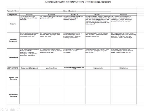
The Begay (2018) & Stockwell (2013) rubrics helped in evaluating the existing apps to target major pain-points in human cognition.

User feedback analysis

Significant qualitative data was extracted from user reviews from the Playstore and Appstore. Manual analysis of the data was done (since the quantity of the data was less) and I drafted the pros and cons to be focused for improvement.

Business & organization needs identified

• Make Mi’kmaw language learning possible for a large user base and increase user retention for strengthening the language in the community (multi-purpose).
• Enable virtual immersive learning possible through enhanced mobile second language learning.

2. sECOND LANGUAGE LEARNING

Why?
- Understand and educate the team in how human cognition works in learning a second language.
- Discover the possible points where a mobile application can provide an added advantage in second language learning?'

Results:

• Introduced the concept of immersion to the design, development and business stakeholders.
• Square on simple features with large impact.

User research gave rise to 3 major factors that can be implemented in the mobile app. The following points were key factors that was considered to create immersion.

Reading & skimming

This forms the major part of a second language learning in a mobile environment. A user who tries to learn a new word or looks for a previously learned word uses a known primary language (in this app - English) to learn the new word.

Audio & visual encoding

The fundamental concepts to immerse a user in second language learning involves audio and visual encoding. The immersion can be text, audio and images placed separately within the same screen or use a video with subtitles to cover all aspects.

Revising

Revising is an important concept to prolong the memory of a learned word or a sentence. Revision can be classified into immediate revision (right after learning), periodical revision (re-learn the learnt at regular intervals) and sporadic revision (re-learn/remind the learnt at irregular intervals ). Each has it's own benefits based on the need and application scheme.

Success metrics
I devised the following success metrics based on the findings from the research. I presented the findings and made it approved by a business analyst for validation:

1. Retention rate (To be increased)
2. Recall rate (To be increased)

3. SYNTHESIS

Why?

User personas & Task Flows:

Find out 'most valuable experience' dedicated for this app.

Brainstorm using sketches:
- Identify and classify users' mental models.


Results:

• Aggregated the users' mental models to form the base of IA design.

The research paved way to determine 3 inter-linked ideation methods.

1. Creating personas & exploring the possible task flows from the results from research.

2. Brainstorming user-generated sketches to visualize the user's expectations & understand users' mental models.

3. Finally, construct the info architecture based on the gathered insights.

User personas & Task flows
After a brief market analysis, 3 distinct user personas were determined and their goals, wants, needs, fears and their environmental contexts were found.

• Locals • Mikmaw students • Tourists.

Possible user flows were predicted based on the mental models of the user personas.
Brainstorm using sketches
To quickly understand the mental models of users, I started the initial sketching phase by making random users sketch. Giving a paper, a marker and a limited time of less than two minutes, the participants were asked to sketch how they'd expect a second language learning mobile application to be.

This type of creative brainstorming provided a brief understanding of the content and architecture that was easy and common across several users.

Since, this is an experimental approach to solve problems, I curated the sketches according to learning immersion perspective and tested the mock-ups for validation. Shortly to say, it was an easy but a powerful technique that holds good for specific circumstances.
Replica of few of the sketches by a 27 year old female participant from the brainstorm session

3. SYNTHESIS

Info architecture
Since the user personas were distinct & having goals with significant variations, the corresponding user flows were complex and had less region of overlapping.

To eliminate user confusion, I decided to combine multiple ambiguous apps into a single app. The information architecture was constructed as a 'hybrid' hub & spoke / daisy model.
Site map

4. the creations

Why?
To introduce 'Progressive disclosure' in the IA based on the aggregated mental models.

Results:

• An IA with high situational awareness.
• Most common test cases (possible) drafted to QA team

Simple & smooth navigation
The main aspects considered when designing navigation were, situational awareness and flexibility for different personas. This concept was followed right from constructing the information architecture and content creation.

Site maps were used and tree testing for less than 10 participants were performed to validate the ease of navigation. After 8-10 iterations, the content placements and narrowing down leads was completed following a simple principle namely, progressive disclosure.

In the early design stages, I also considered error-resistant and error-handling designs by taking note of most-common test cases and by exploring possibilities. This ensured the refinement of the designs much better even in the initial stages.
Lo-Fi prototype - Establishing navigation for 1 user flow (finalized)

4. the creations

Why?
- Introducing focus in a device that is used for instant gratification.
- Multiple modes of encoding to secure 'Sensory information transfer' channels.

Results:

• Secure user's sensory and perception lines.
• Proper use of encoding factors.
• Most common (possible) test cases gifted to the QA team.

Immersion - the experience
Even though various studies suggests another language (especially mother language) can cause interference to learn a new language, a reference language to lead the users to the expected information (words, sentences & categories) is unavoidable.

The only way to encode a new language strongly is to have multiple modes of encoding. For example, for learning the word 'Lion' in Mi'kmaw language, the second language text is placed beneath a relatively large visual of an actual lion.

Also, to double the security of information transfer, audio cues were made available through an icon placed right after simple user-friendly phonetics.

So, for a person to learn the Mi'kmaw word for 'Lion', we created our designs such that, they see the picture of the lion first, immediately look at the Mi'kmaw word, read it out in their minds, click on the audio icon set and finally, have a quick look at the phonetics to make necessary corrections.

By bringing in visual hierarchy according to the learning flow the aforementioned process was achieved. I made sure the assumptions made were right by testing the designs.

A feature to automatically read aloud the sound of the word that's being learned was also designed. This was made optional by considering to respect the user's privacy and the variations in the environment they learn. So, the users can enable/disable this option from the 'settings' panel.
Immersion screen

4. the creations

Why?
- Activate and store learnt information in long term memory.
- Ground-zero features that keep users engaged in a gamified environment

Results:

• Enhanced retention (long term memory)
• Improved recall rates

(Check results section for numbers)

Retention & recall
A simple principle used for retention was a feature of non-intrusive push notifications. This made the revised designs gentle yet effective.

Also, this was designed considering the comfort of the users, because this eliminates the effort to convert ignorance to re-learn by bringing the content to their table. Similar to any push notification, this feature was made optional for the users keeping the user's preference in the teacher's (application's) mind.

For increasing recall rates, gamified reward/point based system involving quizzes were created. These quizzes were classified as immediate & selective quizzes.

In immediate quizzes the user are questioned with recently learned concepts automatically in between learning new words/sentences. In selective quizzes, the revision strategy is set by users where the user can select categories and filters to be quizzed from.
Hi-Fi prototype for 1 user flow (finalized)

5. Test & validate

Why?
- Quickly validate designs
- A precursor for usability testing

Results:

• Rapid iterations to re-design after every changes
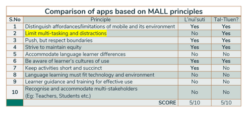
Heuristic evaluation
Usability testing was constantly performed heuristically in 3 different rounds as soon as an iteration ends. The goals of these evaluation were as follows:

• 13 Principles of display design: Improve perception & understanding.

• Gestalt’s laws: Reduce cognitive load.

• MALL, CALL & SLA analysis: Increase rate of acquisition & retention.
Evaluation of MALL principles in the existing apps

5. Test & validate

Why?
- Introducing the prototypes to the users for testing the initial acceptance.
- Testing random users for fixing unknown defects.

Results:
• Found, rectified and iterated minor defects before moving into production.
Guerrilla testing
The Hi-Fi prototypes were moderated usability tested in the form of guerrilla tests for validating the re-designs's acceptance and engagement across participants ranging from 19 to 57 years old within Halifax.

These people were direct representatives of user personas as well as non-conforming users who fall at the left-end of the target user distribution curves.
Moderated navigation test
To validate findability in the designs, participants within specific user persona categories were tested to navigate through the mock-ups.
Evaluation rubric created by Begay (2018)

6. RESULTS

Quick learning

The acquisition rate which was tested by recall tests at the end of guerrilla testing drastically increased by ~200%. This gave a clear understanding of the impact of cognitive theories in UX & immersive learning.

High situational awareness

The fluid navigation gave rise to high situational awareness rates. All 12 participants navigated successfully for 10 destinations challenged. The feedback specified that the signifiers at specific positions in the navigation design was the most compelling reason for this feat.

LEARNING OUTCOMES
FOR PROJECT
-FAILURE: Defects piled up at the end of the design.
+SOLUTION:
Frequent testing along with agile practices can eliminate defect over load at the end.


-FAILURE: Unclear test cases due to collaboration with QA team towards the end.
+SOLUTION:
As a researcher, multiple test case scenarios can be communicate earlier through collaboration. This pressed the importance to socialize research findings early in the process.


• When the entire team understands the importance of human cognition and UX, with an added creativity, the results peak up.

• Testimonials resulted in establishing higher user trust than advertisements or preaching.
FOR SELF
- FAILURE: Limited resources but a huge project potential (time & cost).
+ SOLUTION: Prioritize tasks using Pareto principle.


-FAILURE: Multi-modal research practices for tactical UX resulted in low accuracy of results.
+SOLUTION:
Target specific research methods and explore deeper. Make use of qualitative data wisely.


• Manage the proportion and intrusion of research insights based on team norms.

• In a short timeline, DON’T skip research. Instead gather insights from existing research pools, literature and validated data for visible benefits.